Conditional visibility: A beginner guide to dynamic elements in Bubble
Creating dynamic, responsive, and intuitive user interfaces is a cornerstone of modern web applications. Elements that appear or disappear based on user actions, screen size, or data states make your application feel smarter and prevent users from being overwhelmed. In Bubble.io, this power is unlocked through Conditional Visibility.
This tutorial will guide you through the fundamental concepts and practical applications of conditional visibility in Bubble, turning you into a pro at controlling which elements your users see and when.
By the end of this tutorial, you will understand how to use Bubble's "Conditional" tab to show, hide, and change properties of elements based on various real-time conditions.
Understanding the conditional tab
Every element you place on your Bubble page has a default visibility setting and a powerful tab for adding dynamic rules.
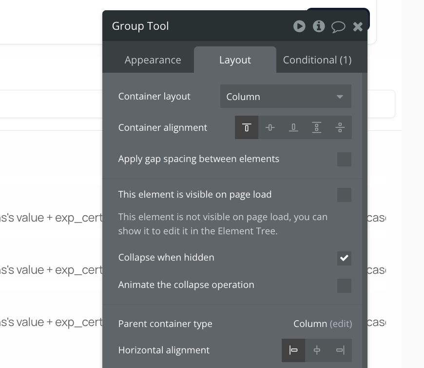
1.1 Initial visibility: "This element is visible on page load"
-
Where to find it: Select any visual element on your page (like a Group, Text element, Button, Input, etc.). In the property editor that appears, look under the "Layout" tab.
-
The setting: You'll see a checkbox labelled "This element is visible on page load."
- Checked (Default): The element will be visible as soon as the page finishes loading, assuming no conditions later hide it.
- Unchecked: The element will be hidden when the page loads. It will only become visible if a condition you set specifically makes it visible.
-
When to uncheck it: You typically uncheck this box for elements you only want to appear under specific circumstances. Examples include:
- A pop-up or modal window.
- An error message that only shows after a failed action.
- Extra form fields that appear based on a previous selection.
- A mobile menu icon that only shows on smaller screens.
1.2 Adding dynamic rules to the conditional tab
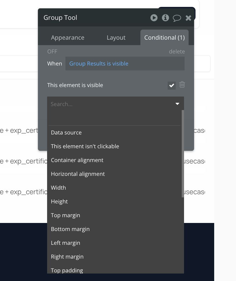
The real magic happens here. The "Conditional" tab allows you to define rules that change an element's appearance, visibility, or other properties when a specific condition is met.
-
Where to find it: Select any visual element. In the property editor, click on the "Conditional" tab.
-
The structure: The tab shows a list of conditions. Initially, it's empty. You add conditions by clicking the "Define another condition" button. Each condition follows the structure:
- When [Condition is true]...
- Then [Apply these property changes]
-
How to add a condition:
- Select the element you want to make conditional.
- Open its property editor.
- Click the Conditional tab.
- Click the Define another condition button.
- Click where it says "Click here to define a condition". This opens a dropdown/input area where you build your logical statement.
- Once the condition is defined (it should evaluate to yes or no, true or false), click where it says "Click here to define another property."
- From the dropdown that appears, select the property you want to change. For visibility, you'll most commonly select This element is visible.
- Specify the value for that property when the condition is true. For `This element is visible`, you'll choose yes or no.
-
Building conditions: Conditions are powerful expressions. They can check:
- The value of an input or dropdown (`Input A's value is "xyz"`)
- The state of a checkbox (`Checkbox B is checked`)
- Whether a user is logged in (`Current User is logged in`)
- Properties of the current user (`Current User's role is "Admin"`)
- The state of another element (`Group C is hovered, Repeating Group D is loading`)
- Page properties (`Current Page width < 768`)
- Data from the database (`Do a search for Users:count > 0`)
- Custom states
-
Defining property changes: While this tutorial focuses on visibility (This element is visible), you can change many other properties conditionally, such as:
- Font colour, size, style
- Background colour or image
- Border properties
- Element size or position (though Responsive settings often handle this better)
- Text displayed (This element's text is "Loading...")
- The data source of repeating groups or groups.
Practical examples
Let's apply these concepts to common scenarios.
Example 1: Dynamic forms - Showing an input based on a dropdown selection
Goal: Have a "Contact Reason" dropdown. If the user selects "Other," an additional "Please Specify" input field appears.
Setup:
- Place a Dropdown element on your page. Name it "Dropdown Contact Reason”.
- In its property editor, set the "Choices style" to Static choices.
- Add some choices, for example: Support Inquiry, Sales Question, Feedback, Other.
- Place an Input element below the dropdown. Name it "Input Specify Reason”.
- In the “Input Specify Reason's property” editor, under the Layout tab, uncheck the box "This element is visible on page load." This is crucial – we want it hidden initially.
Adding the conditional logic:
-
Select the "Input Specify Reason” element.
-
Open its property editor and click the Conditional tab.
-
Click Define another condition.
-
Click where it says "Click here to define a condition".
-
Start typing the name of your dropdown:
Dropdown Contact Reason. Select it from the list. -
Add the operator: Click after the Dropdown Contact Reason and select
's value is. -
Specify the value: Type "Other" (make sure it exactly matches the dropdown choice, including capitalisation).
Your condition should look like this:
Dropdown Contact Reason's value is "Other" -
Now, click where it says "Click here to define another property."
-
From the dropdown list of properties, select
This element is visible. -
Next to
is, select yes from the dropdown.Your full conditional rule should look like this:
When Dropdown Contact Reason's value is "Other" Then This element is visible is "yes"
Preview your page. Initially, you should only see the dropdown (and your other form elements, but not the "Please Specify" input).
Click the dropdown and select Support Inquiry or Sales Question. The input remains hidden.
Click the dropdown and select Other. The "Please Specify" input field should instantly appear below the dropdown.
Example 2: User States - Showing different content for logged-in vs. logged-out users
Goal: Display a "Login/Signup" button group for logged-out users and a "Welcome, [User's Name]" message for logged-in users.
Setup:
- Create a Group containing your "Login" and "Signup" buttons. Name it “Group Logged Out”.
- Create another Group containing a Text element like "Welcome, " followed by a Text element displaying
Current User's Name. Name this group "Group Logged In Welcome”. - In the
Group Logged Out's property editor, under Layout, keep "This element is visible on page load" checked. - In the
Group Logged In Welcome's property editor, under Layout, uncheck the box "This element is visible on page load." We want it hidden initially.
Adding the conditional logic:
-
For the Group Logged Out (hide if logged in):
-
Select Group Logged Out.
-
Go to the Conditional tab.
-
Click Define another condition.
-
Click where it says "Click here to define a condition".
-
Select Current User.
-
Add the operator: Select is logged in.
-
Set the value to yes.
- Condition: Current User is logged in is "yes"
-
Click where it says "Click here to define another property."
-
Select
This element is visible. -
Set the value to
no.Rule: `When Current User is logged in is "yes"` Then `This element is visible is "no"`
-
-
For the Group Logged In Welcome (show if logged in):
-
Select Group Logged In Welcome.
-
Go to the Conditional tab.
-
Click Define another condition.
-
Click where it says "Click here to define a condition".
-
Select Current User.
-
Select the operator: is logged in.
-
Set the value to yes.
Condition: `Current User is logged in is "yes"`
-
Click where it says "Click here to define another property."
-
Select `This element is visible`.
-
Set the value to
yes.Rule: `When Current User is logged in is "yes"` Then `This element is visible is "yes"`
-
Testing:
- Preview your page without being logged in. You should see the "Login/Signup" buttons. The "Welcome" message group should be hidden.
- Log in as a user (you'll need login/signup workflows set up for this).
- Once logged in, the page should update: the "Login/Signup" buttons disappear, and the "Welcome, [Your Name]" message appears.
(Note: You can extend this using `Current User's [Data Field]` conditions to show content based on user roles, subscription status, etc.)
Conclusion
Conditional visibility is a foundational technique in Bubble.io that allows you to build sophisticated, responsive, and user-friendly applications without writing code. By mastering the "Conditional" tab, understanding the initial visibility setting, leveraging groups and custom states, and using the debugger, you gain precise control over your user interface.
Start simple with toggling individual elements, then progress to grouping elements and using custom states for more complex interactions.
ABOUT ME
I'm Juliet Edjere, a no-code professional focused on automation, product development, and building scalable solutions with no coding knowledge.
Learn from practical examples and explore the possibilities of no-code, AI and automation. We'll navigate the tools, platforms, and strategies, one article at a time!
Visit my website → built with Carrd


