How I designed and launched my personal portfolio in a day with Carrd
This post reflects the tools and landscape at the time of writing. The core principles of planning, seeking inspiration, and focusing on a clear message, however, are timeless.
Build Time: 1 Day Tools: Figma, Behance, Carrd
With so many resume templates and cookie-cutter LinkedIn profiles out there, standing out can feel like an uphill battle. I found myself in that exact position, feeling that my digital presence didn't truly represent my skills or my personality. I realised I needed more than a document; I needed a living, breathing space on the web that could tell my story. That’s when I decided to embark on a one-day challenge: build a personal portfolio website from scratch.
This is how I did it, from the initial spark of an idea to the final launch, including the unexpected detours and the key decisions that shaped the final product.
Choose the right foundation
Every good project starts with the right set of tools.
My initial plan was to use Disha.ng, a platform I was familiar with and admired. However, in a classic real-world scenario that every project manager knows too well, I hit a roadblock on day one. A notice on their homepage announced they would be shutting down on December 31, 2022. My first choice was gone, and I had to pivot fast.
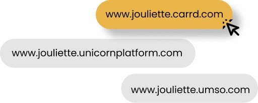
My search led me to a few popular no-code website builders: Unicorn Platform, Carrd and Umso. While all are excellent, the choice became surprisingly clear after a bit of research. Carrd offered a level of flexibility with its domain names that I found incredibly appealing, providing options like .carrd.co, .crd.co, and .umu.ai. This might seem like a small detail, but your web address is a core part of your online brand. I recommend choosing a root domain that is easy for people to remember and spell, and that complements the personal name or brand you're building. For me, Carrd was the no-brainer choice.
Carrd is optimized to create simple, one-page websites.
Step 1: The hunt for inspiration
With my platform selected, I needed a vision. I didn't want to build in the dark, so I turned to my go-to sources for design inspiration: Behance and Pinterest. I wasn't just looking for pretty websites; I went into this "discovery phase" with a clear set of goals for my portfolio:
- It had to be clean, yet unique. I wanted a design that felt modern and uncluttered but had a distinct personality that set it apart.
- It needed to be fast. In a world of short attention spans, slow page-load speeds are a dealbreaker. The design had to be lightweight and efficient.
- It had to make contact easy. The ultimate goal of a portfolio is to generate opportunities, so a clear and simple way for visitors to get in touch was non-negotiable.
- It needed clear content blocks to logically showcase my projects, skills, and experience without overwhelming the visitor.
I spent time absorbing different layouts, colour schemes, and typographic styles, allowing a mental blueprint of my own site to begin taking shape.
Here's a thread on inspirations:
Step 2: Crafting a visual identity
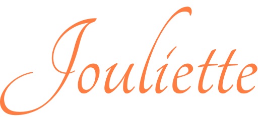
The design process began in Figma. The first order of business was creating a logo. Staying true to my goal of showing personality, I wanted to avoid a generic, corporate feel. My aim was a simple yet slick logo that used my name in a decorative, handwritten style. After experimenting with several variations of "handwriting" fonts, I settled on a style using the Tangerine font that felt both personal and professional.
With the logo established, I moved on to the most important part of any one-page site: the hero section. This is your digital first impression, your chance to immediately communicate who you are and what you do. I decided on a bold black-and-white aesthetic with a single, vibrant splash of colour to draw the eye and add personality.
For the background, I chose a high-quality image, and then I focused on the messaging. This was my opportunity to speak directly to the visitor. I intentionally used first-person language throughout the site to create a more direct, conversational tone, as if I were speaking to them in person. The headline was crafted to be a relatable but original message that clearly communicated how I could help a potential client or employer. From there, I structured the rest of the page, laying out the sections for my services, tools, and project showcases in a logical flow.
Building and launching in Carrd
With my designs finalised in Figma, the final step was to bring them to life. Because I had done the preparatory work of designing everything first, the actual build process in Carrd was incredibly fast and smooth. It became a matter of translating my design components into Carrd's intuitive builder, populating the content blocks, and ensuring everything linked up correctly.
Within a single day, I had gone from a simple idea to a fully functional, live portfolio that I was proud to share. This project was a powerful reminder that with the right tools and a clear plan, you can create a professional and personalised online presence without a team of developers or a massive budget.
You can view the live site here: ⬇
ABOUT ME
I'm Juliet Edjere, a systems thinker focused on how AI changes operations, how organisations evolve, how workflows break down, and on building scalable solutions.
I help organisations redesign workflows, operations, and knowledge systems for the AI era. All things: systems thinking, operational design, AI-era workflows, knowledge infrastructure
Visit my website → built with Carrd
Other Posts